|
It's been a few months, so I believe that a game review is in order, so I might as well pick something that I was unable to put down for weeks on end. The Final Fantasy 7 Remake. Now seeing as I'm not that old, I never had the pleasure of playing the original when it came out in 1997, but I've known about its influence not just on the RPG genre, but on gaming and popular culture as a whole my entire life. This behemoth of a game, originally released on three separate discs due to the hardware limitations of the PS1, captured the hearts and minds of millions across the globe and by far becoming the most popular game in Square Enix's library. Hoping to revive and pay ohmage to the incredible success of the original, a remake was announced in 2015, after almost a decade of rumors and speculation that a remake was on the way. The game would not be released until 2020, with the COVID pandemic taking up the majority of the media attention at the time. Let's just say that it went over really, really well... 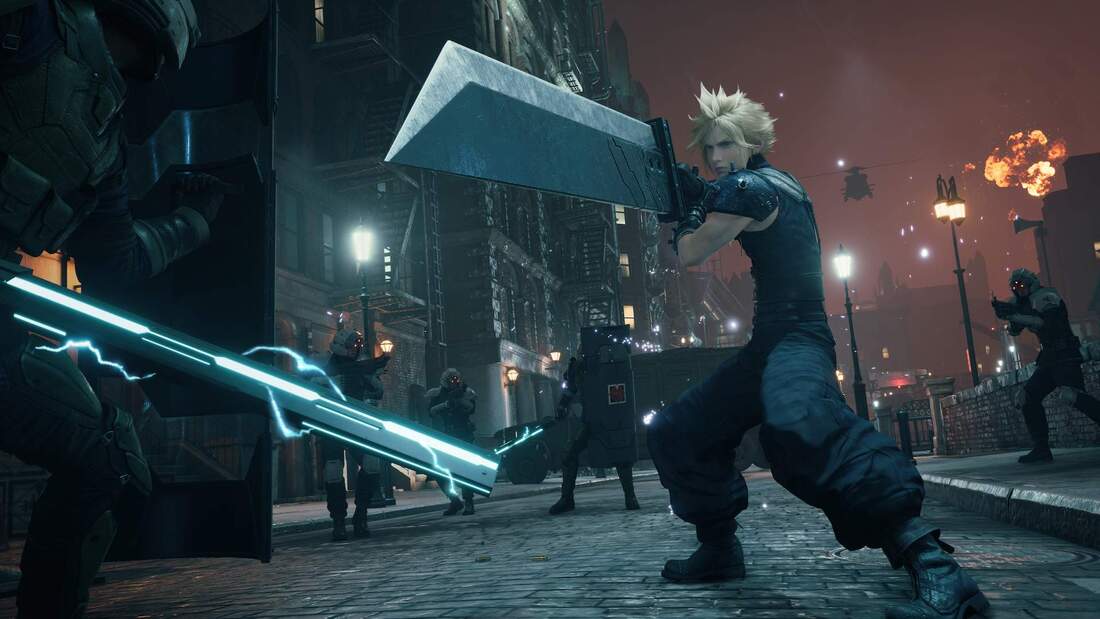 Gameplay/Experience Shifting away from the traditional turn-based battle system, the FFVII Remake instead opts for a free form fighting system, reliant on precise attacks and dodging, mixed with spells and items with the use of a quick menu. This method was first tried in 2015 in Final Fantasy 15, which was met with mixed reviews. It was then adjusted and highly polished for use in this newest remake, and it sure does show. In comparison to the previous attempt back in FFXV, the remake manages to make free form fighting feel fresh and rewarding, with a variety of moves and tactics available to the 4 main playable characters of the game, each of which sporting a list of special weapons and abilities. Unlike FFXV, I went out of my way to complete as many side quests as possible, because not only were they rewarding and manageable, but they were actually fun to complete. Moving on to the environment, we get to one of the selling points of the remake, it's incredible level design. The city of Midgar (the location the entire game takes place in) not only feels massive but is genuinely pleasing to look at. Every corner of the city shines with a level of polish that the developers clearly put years of work into. Despite the fact that missions take you to select areas rather than use a free-roam system, the city itself still feels massive and entertaining everywhere you go. And last but not least, the cast. I've never been one for the typical RPG cast, since they more often than not fill very clique niches and have very predictable personalities. Fortunately, the remake has stuck to the characteristics of the cast characters that captivated so many players with the original release. Characters like Barret, Tifa, and Aerith are some of the greatest and most genuine personalities that I have ever seen in a video game, and every second spent in their presence made the game just that much better. Art Direction/Audio As touched on earlier, the world of Midgar has been expanded to a scale unseen by its previous counterpart and makes up a vast majority of the game's appeal in the realm of art direction. The sheer amount of detail in the environment, regardless of whether or not it is interactable to the player, is staggering. Being able to see into the distance and still make out distinct 3D models shows how technically impressive this game is as a whole. There is eventually a point where the environment turns into 2D images, but the use of some clever camera and wrapping techniques manages to make it look 3D regardless. Audio also takes full advantage of the many incredible soundtracks made in the original game, remaking them as well and adding an extra layer of polish all around. Many classic tracks remain in the game, now modernized with orchestral arrangements and even some entirely new verses. It's quite fair to say that they are just as enjoyable to listen to in their revamped state as they were in the original. 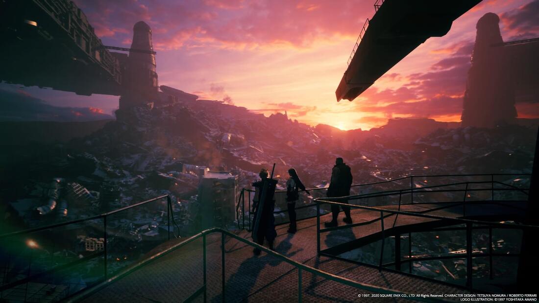 Stability/Performance My personal playthrough on the game was done on the PS5, using the performance mode at 60fps. My playthrough took about 35 hours and never ran into a single issue along the way. This is quite impressive considering the sheer amount that the game has to render at all times. Verdict Again, I never had the pleasure of playing the original when it came out, which is not exactly something that I can change, but I can at the very least appreciate the enormous impact it has had on popular culture since then. I can also appreciate the classic story in its new and refreshed state, which I have enjoyed thoroughly from start to finish. Every once in a while, I'll finish a game and just sit in silence and awe. Only one word comes to mind when I describe those games: "Wow". And it is with a great honor that I can say that this is one of those games. 10/10 Image 1 Source: FINAL FANTASY VII REMAKE INTERGRADE on PC | Square Enix Blog (square-enix-games.com)
Image 2 Source: Final Fantasy VII Remake review | Engadget
0 Comments
I'll say it, this week was substantially slower in comparison, but not exactly for entirely negative reasons. This week I spent a substantial amount of time troubleshooting with other members, as well as trying to work out a more efficient system of file management in the future, the latter taking far more time in comparison. Because of this, I wasn't able to focus much on creating actual 2D assets, with the extent of my individual work being the creation of a script for the opening cutscene, which will be my focus in the coming weeks. I spent a lot of time this week managing my team, which is good due to the need to keep everyone on the same page. This time around I plan to spend a little more time on my own personal projects, which are essential if my teammates are to get anywhere. This also includes laying out a clearer roadmap for development, so then each member can operate automatously without oversight. All in all, good progress is still being made, and I plan to ramp up my personal work once again in order to keep up with the pace of the overall group, since they'll ultimately need my work one way or another if they are to make progress as well. 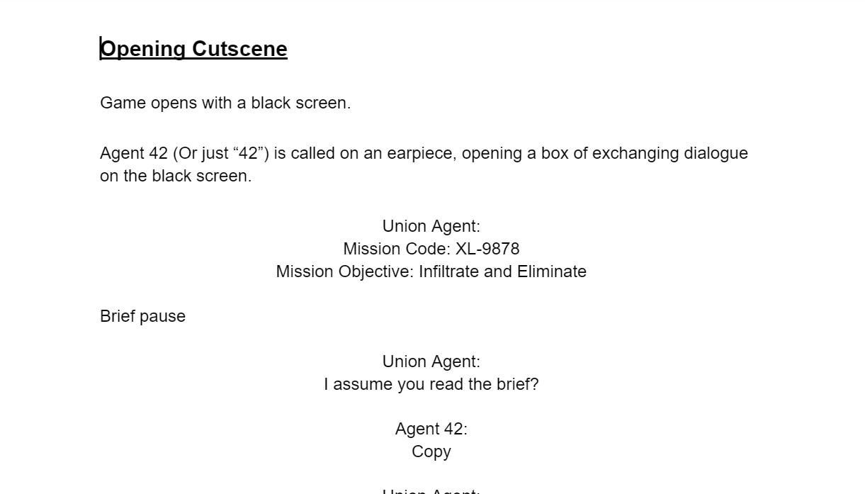 These are the plans for the week moving forward. Monday: Tie up loose ends with the whiteboxing process and continue on opening cutscene production. Tuesday: Animation of the opening cutscene. Wednesday: Continued cutscene animation and player sprite animation. Thursday: Player sprite animation and testing in Unity Game Engine. Friday: Transfer of first full player controller over to whiteboxing prototype.
Here we are again with the daily check-in, featuring your friendly-neighborhood team lead! This week in particular served as a continuation of last week, with the creation of a few more sprites and the process of implementing them directly into the Unity engine. This not only provided a few more assets for the final product but helped begin the process of a full team transfer onto a shared file, which will be my focus for this week as well. I also feel that this week was a little slower in comparison, at least in terms of making individual assets. The reason this is the case, however, is because I spent an extra amount of time helping my teammates with various issues, as well as spending more time as the team lead rather than the 2D artists, which is going to happen every once in a while. Regardless, I believe that I am making good progress in both areas. The plan for this week is as follows: Monday: Move entire team onto shared Unity file Tuesday: Continue animation and imports into Unity engine Wednesday: Further animation work Thursday: Implementation of animated sprites with respective player and enemy scripts Friday: Addition of whiteboxing for 3D environment. 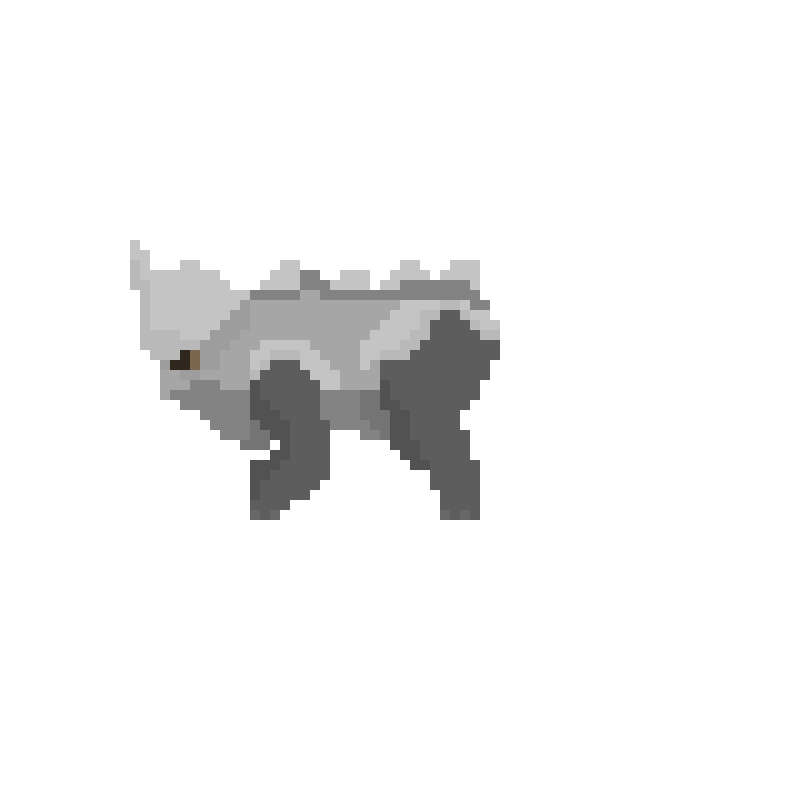
This, my friends, will be the first of many updates that I will post as part of our development process for our final team game. The production of Zenith will require a clear timeline and detailed path as to where the project will head. As of right now, I have started with simple animations to remind myself of the process, as well as knock out a number of essential enemy types early. My creation of a number of idle animations is a clear and simple example of my role as the resident 2D artist and animator, and the addition of these animations will aid my teammates as the overall world is flushed out and brought to life. Overall, I ran into very few problems, which is good in this particular aspect of the team project. That does not mean that this will not be a long and arduous process, as these are only a few of the many animations that I will have to move forward with making. 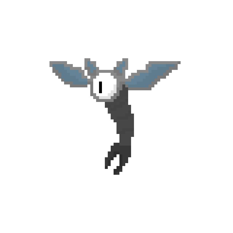 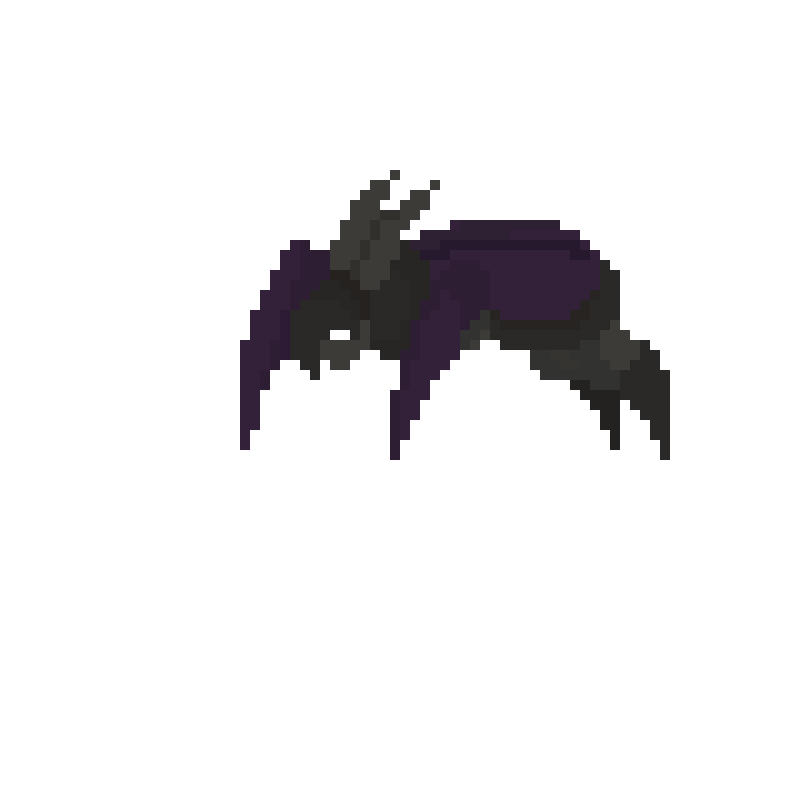 I believe that the relative speed that I made these animations with is a very good sign, meaning that I can pump these out without too much risk of falling behind. That and my ability to do them in this manner after a long hiatus from animation fills me with a newfound level of confidence. My future plans are now to focus on the animations custom to the main character, mainly so the programmers can then move in to programming him in to make the gameplay functional to a degree, which then allows for the development of the rest of the game.
Anyway, it's time I got back to it.
As part of the AGAD schedule, we must now move out of our PBM assignments and back into team work to finish our games by the end of the year. While I am eager to get back into this process, it does pose a few problems, mainly how rusty the class will be moving back into teams. The entire class has been away from team work for a number of weeks now, meaning that people will need to get back into the swing of things once the main project picks up again. That and people will have to refresh their memories on what their game overview even is in the first place. This does pose a number of issues when moving back in, but the experience provided by the PBM assignment will help soften the blow of this transition if just by a little bit. The skills we relearned in the Unity Engine and coding software should prove helpful when each team member moves back into their assigned roles. This is especially important in the coding sector, as almost every single person in the class had issues with coding one way or another. I genuinely hope that I won't find myself to be disoriented once this shift back into teams occurs, and I can quickly get back into the sector of game design that I specialize in.
After all this time, the parkour level is finally finished, and what a process this was. From start to finish, the entire project feels like it's taken years to complete, mainly due to the enormous number of steps in the entire development process. That being said, the entire process provided a good number of ups and downs, as well as an expectation of what is to come. 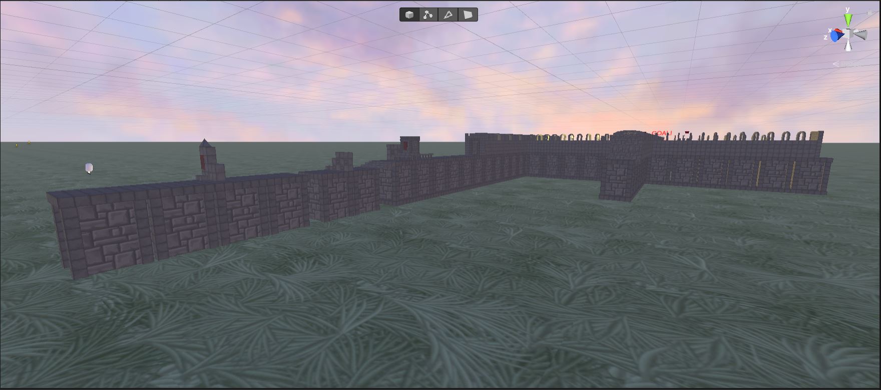 The finished level design ended up being wildly different from the original drafts and concepts, especially since the original design just didn't function on a base level, with objects clipping into one another and floating in random directions. The process of making the game linear did fix this issue, as it limited the number of overlapping colliders and lowered the overall density of the environment. Although I still did find a good number of issues as I worked out the coding along the way. All in all, I think this worked out quite well for the timeframe I was given, and even could have done better if not for the setbacks encountered with the original design. I hope to take these mistakes and learn from them in a way that benefits my future projects and creations in this particular class, especially as we move back into team games for the rest of the year. This sure was a short post, but one that needed to be written for the sake of self-reflection and a clean conclusion.
After completing the pre-production phase of the parkour level, I moved into the editor to model out and create the entire level. This process came with a number of ups and downs, all of which will be explained in this particular post. 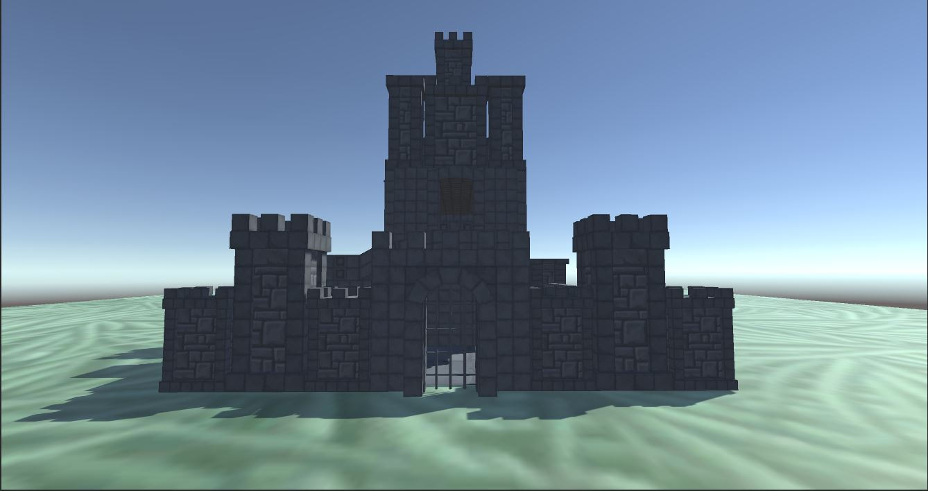 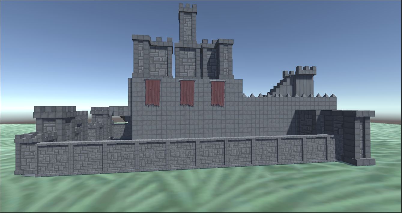 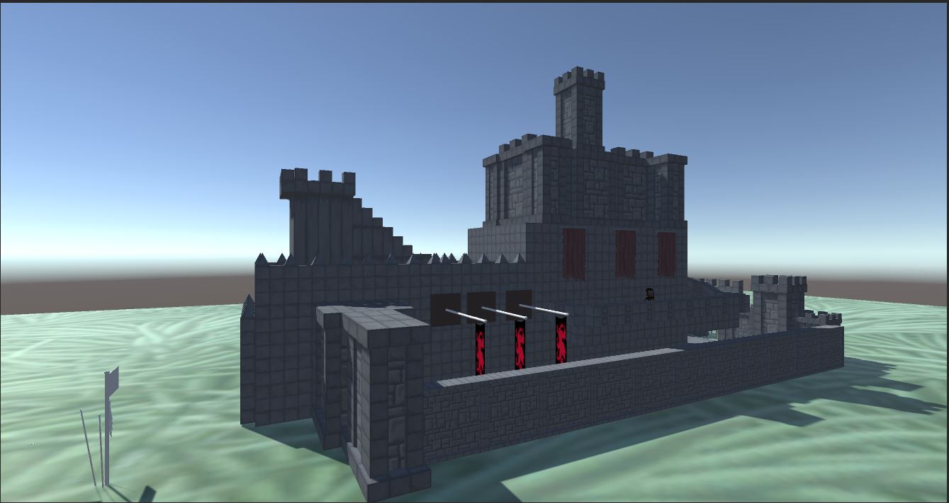 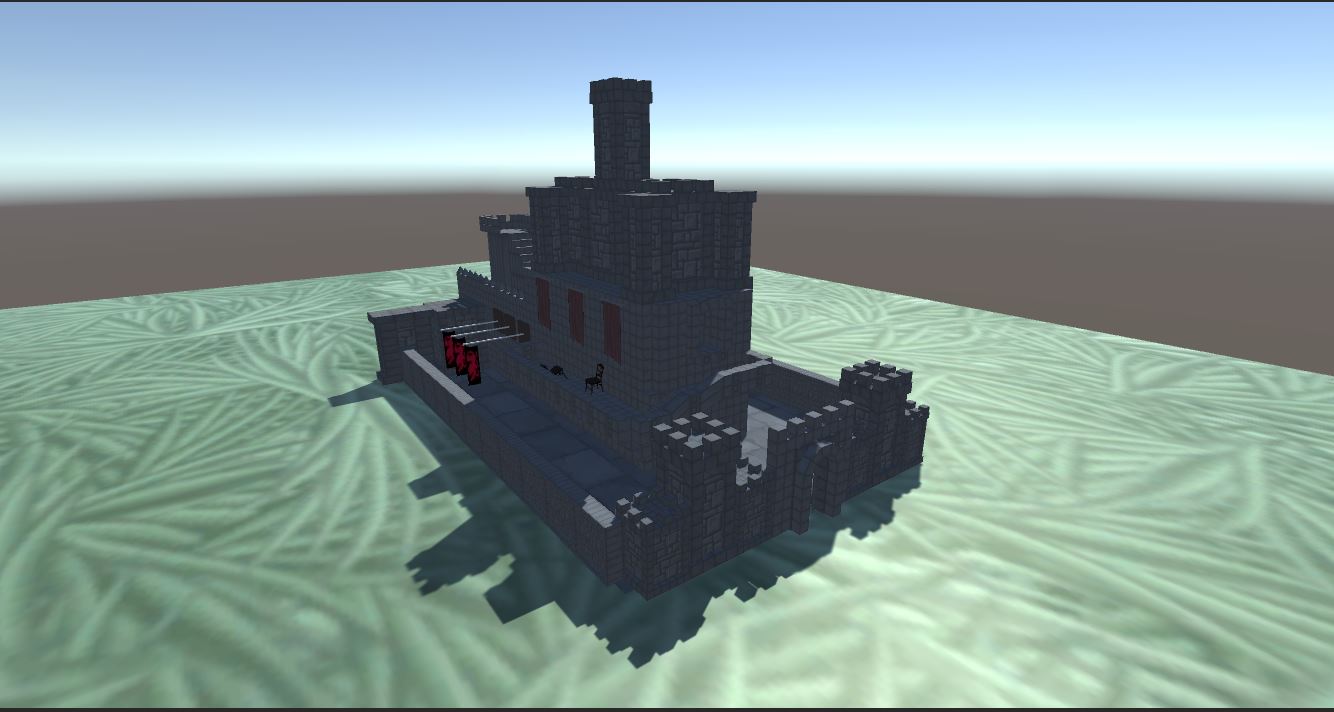 As you can probably tell, I spent a fair amount of time modeling this castle level, so much so that it is the only one I was able to finish out of the two I planned. I was fortunate enough to find a castle building asset pack on the Unity Store, practically giving me a giant stone LEGO set to work with. I made use of this and the ProBuilder tool to make the castle my own, complete with hallways and balconies for the player to run along. In terms of modeling, I'm extremely pleased with how it turned out, even more than I expected. Sadly, this is about where the positives start to end. While I was glad with the overall appearance, functionality took a backseat for reasons I cannot explain, mainly the fact that random surfaces are not solid and can be easily walked through. The reason I find this irritating is because I set each and every object with a modifier that makes them solid to walk on. So why don't they all work? My honest answer is this: I just don't know. I was running low on time to work this out in the first place, so I fully plan to work out the bugs after this school quarter ends, and my schoolwork enters a brief reset period as the new quarter begins. This project has yielded many accomplishments and irritations, and I plan to take advantage of each and every on when I find the time. I will finish this level in time for the PBMs.
As part of our refresher course into the Unity game engine, my entire class was assigned to map out and create a personal parkour level. This process, like all others in the design pipeline, requires thorough planning and sketching in the pre-production phase, which is exactly what I ended up doing. 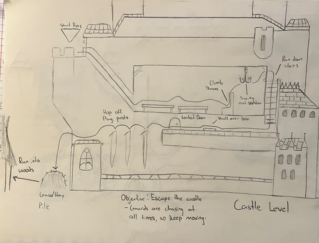 Level 1: Castle Grounds 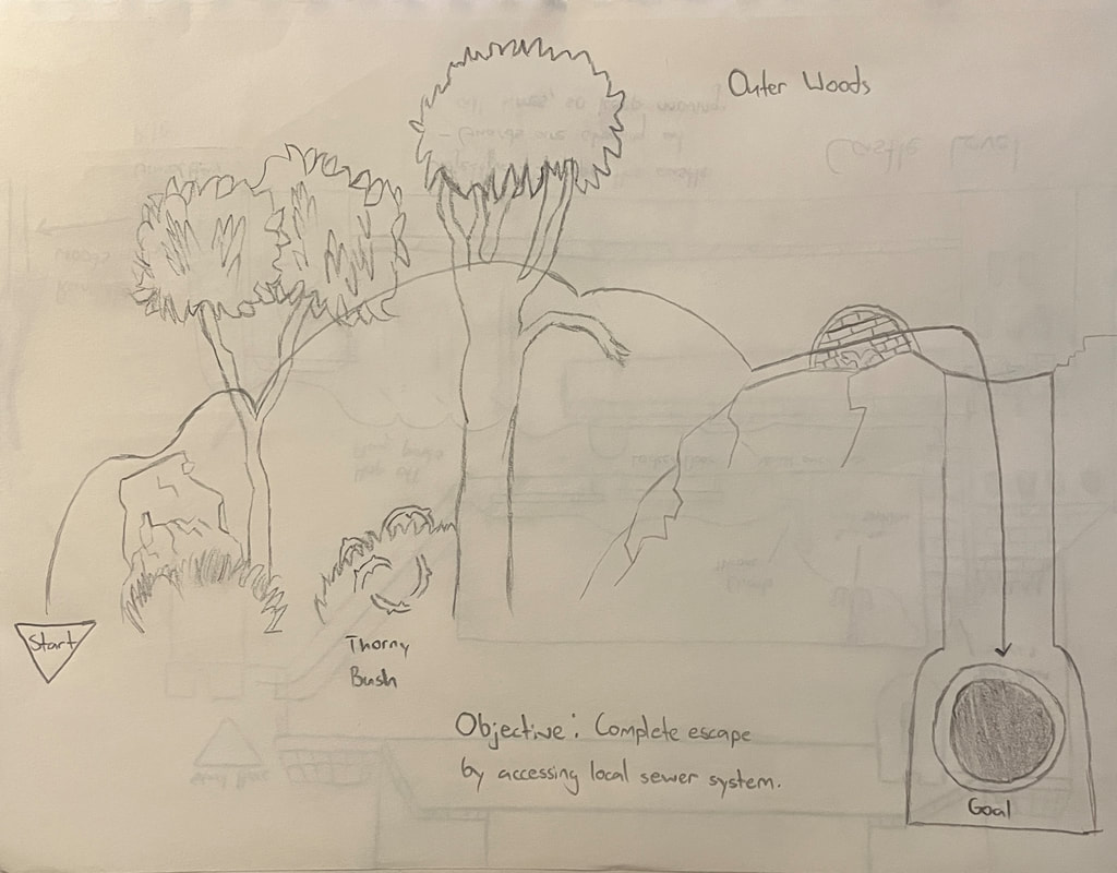 Level 2: Forest Outskirts 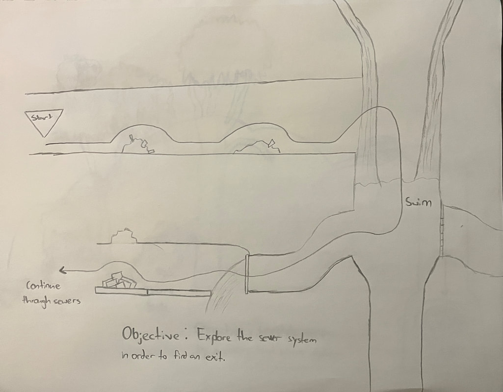 Level 3: Sewer System A seen in the images above, the overall parkour experience is split into three separate levels, each of which lead into each other in chronological order. The order goes as follows: Starting in the main castle, the player needs to escape the building and run into the nearby woods, after some running in the woods, a nearby sewer grate provides the player with an ultimate escape into the sewer system. The overall gimmick of the level is that the player is pursued by castle guards at all times, meaning that the need to stay moving is critical, as well as find an escape route amidst the constantly moving environment. Typical controls are used as well, using WASD to move, and space to jump. The gameplay itself is very easy to pick up and understand, with the main challenge coming in the form of mentally registering pathways and constantly moving to stay ahead of the guards. This quick blog post was to describe the overall thought process that went into the design of my personal levels and will be followed by another post going into greater detail on the design process, as well as my accomplishments and issues along the way.
As part of the development process in AGAD, we were all required to take a refresher course on the Unity Game engine, as every team member will be using it to some degree with slight modifications. Now I have to say... this was much easier to understand than the last time we went over this course. Not only was the instructor far clearer on the directions, but he was just easier to listen to and understand overall. I say this because the last course we did, the one that introduced us to the engine the first time, was extra-long and very tedious to get through. All and all, most of the information was old news to me, but I was still in need of a reminder course like that, just to get the gears turning again. I did however learn a few extra techniques, like the use of a spotlight, which can be attached to a player and serve as a flashlight. Features like that I see being extremely useful as I navigate the engine again. As for my struggles? Well, I know for a fact that all of my issues are going to be in the programming part of the engine, which is a later unit for us. In terms of the interface and direct engine features however, I find myself set up quite well. Programming has proven to not be my cup of tea, but alas, I will have to learn it at some point.
An essential part to any video game is what info the player is actually made aware of, usually through obvious visual and audio clues. Aside from that, the most common source of relaying information to the player is through the UI or "user interface". This interface takes many forms, from telling the player about their inventory with bright visuals and obvious numbers, or being relatively nonexistent for atmospheric affect. Knowing how to make use of this interface is what provides many well-composed games with an extra level of polish and professionalism. To illustrate this point, I will take two examples of UIs, each with different styles, purposes, and overall affect, and explain how they ultimately achieve the same goal. 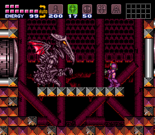 Super Metroid (1994) The first example presented here is a screenshot from the game Super Metroid, a sci-fi 2D platformer published by Nintendo in 1994. This particular entry in the series not only paved the way for UI design in future Metroid games, but also has many great examples of interface design still used by many Metroidvanias to this day. The main feature available to the player is the very noticeable items sitting at the top, which can be cycled through with the press of a button to access various weapons and features. This quick swap means that there is no need to open a menu in order to swap weapons, and a variety of attacks can be preformed mid-combat. Aside from this, the health bar sits in the top-left corner, which is a staple feature of almost all UI designs across all games. The mini-map also sits in the top-right corner, which displays adjacent rooms to the player, and are viewable at all times. This map can be opened into a world map in a separate menu, which, gives the player access to a much wider area to survey. All in all, this particular UI serves all of it's purposes extraordinarily well, and still presents the needed information despite its age. 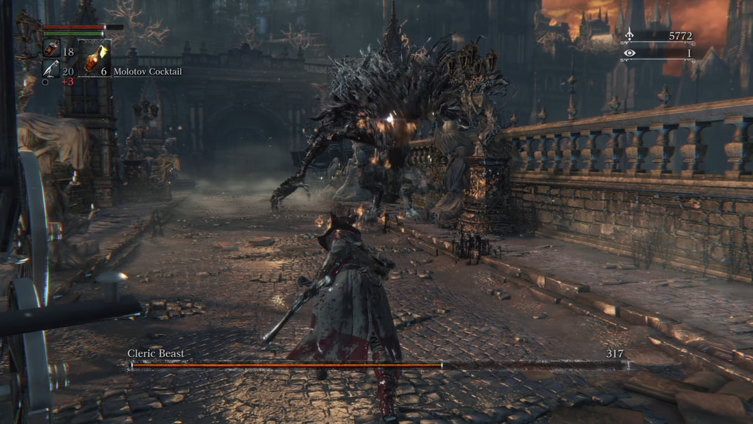 Bloodborne (2015) My second example is from the game Bloodborne, a gothic horror action RPG published by From Software in 2015. Bloodborne, as a game, follows a very particular formula that the From Software team has become well known for over the past decade. Now in terms of UI, it also follows many common formulas, mainly the health bar in the top-left corner, and the boss health bar in a noticeable location. Items are now instead placed right below the health bar, enough to the point that they cycled through and accessed. The currency is also managed in the top-right corner this time around. The main goal of the UI in this particular game is to provide the player with the information they need, all the while staying small and minimal in order to give the player a wide field of view, as mobility and situational awareness are essential in From Software games, which are typically notorious for being exceptionally difficult. This goal is achieved to great affect, as the small UI gives the player a wide area of view, and leaves them more space to focus on the horrific environments that the game wants you to pay attention to. 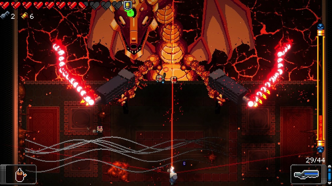 My third and final example comes from Enter the Gungeon, a bullet-hell roguelike published by Dodge Roll in 2016. Being a bullet-hell, a game such as this is typically going to have a very full screen, which the developers accommodated for in their UI design. They did this by pushing all of the essential information against the sides of the screen, which leaves plenty of open space for combat to occur. These essential items are still brightly colored however, in order to leave them readily available for the player. Besides this, all of the essential items remain, from player health, to boss health and active weapons, which can be cycled with a button press. As seen in these various examples, every game has something to gain with UI design, whether it be to improve upon player experience, or to add to the game's overall environment. Using these principles of design can in turn greatly improve a game's overall polish and appeal to the player, and we can easily see how developers have been aware of this for some time. Hence why all designs follow the essential formula, all the while being true to themselves and their creative vision.
|
AuthorI have a passion for creating things, and hopefully one day those things will be video games. You can check over on this blog if you wish to see any updates on my work or other subjects. The views and opinions expressed in this blog are solely those of the author and do not represent those of Durham School of the Arts or Durham Public Schools.
Archives
May 2022
Categories
All
|
 RSS Feed
