|
An essential part to any video game is what info the player is actually made aware of, usually through obvious visual and audio clues. Aside from that, the most common source of relaying information to the player is through the UI or "user interface". This interface takes many forms, from telling the player about their inventory with bright visuals and obvious numbers, or being relatively nonexistent for atmospheric affect. Knowing how to make use of this interface is what provides many well-composed games with an extra level of polish and professionalism. To illustrate this point, I will take two examples of UIs, each with different styles, purposes, and overall affect, and explain how they ultimately achieve the same goal. 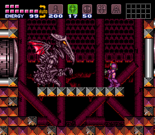 Super Metroid (1994) The first example presented here is a screenshot from the game Super Metroid, a sci-fi 2D platformer published by Nintendo in 1994. This particular entry in the series not only paved the way for UI design in future Metroid games, but also has many great examples of interface design still used by many Metroidvanias to this day. The main feature available to the player is the very noticeable items sitting at the top, which can be cycled through with the press of a button to access various weapons and features. This quick swap means that there is no need to open a menu in order to swap weapons, and a variety of attacks can be preformed mid-combat. Aside from this, the health bar sits in the top-left corner, which is a staple feature of almost all UI designs across all games. The mini-map also sits in the top-right corner, which displays adjacent rooms to the player, and are viewable at all times. This map can be opened into a world map in a separate menu, which, gives the player access to a much wider area to survey. All in all, this particular UI serves all of it's purposes extraordinarily well, and still presents the needed information despite its age. 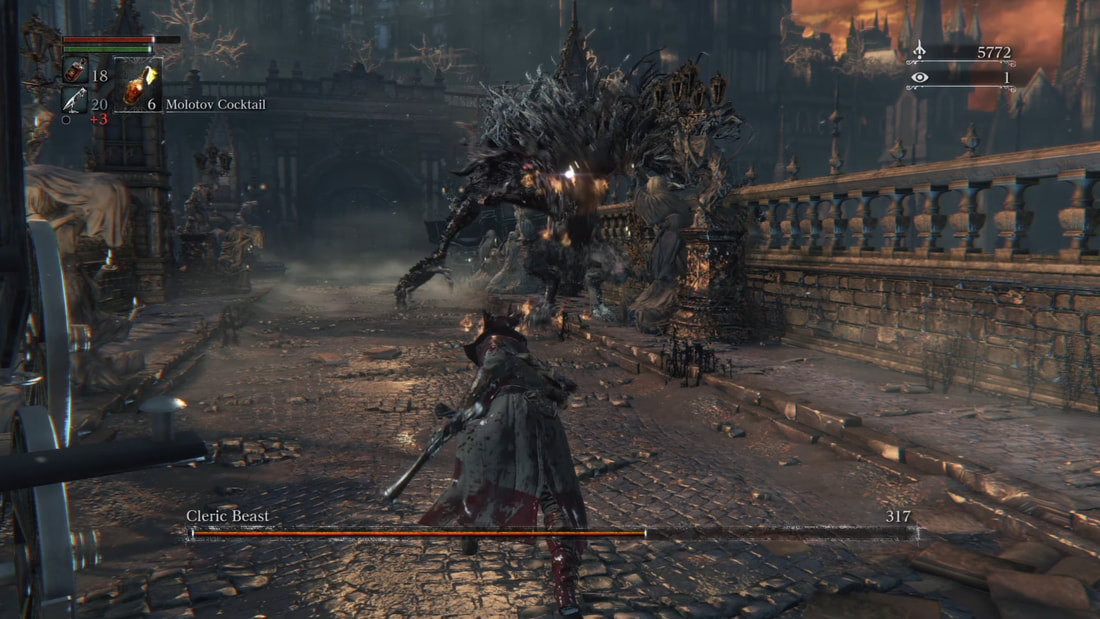 Bloodborne (2015) My second example is from the game Bloodborne, a gothic horror action RPG published by From Software in 2015. Bloodborne, as a game, follows a very particular formula that the From Software team has become well known for over the past decade. Now in terms of UI, it also follows many common formulas, mainly the health bar in the top-left corner, and the boss health bar in a noticeable location. Items are now instead placed right below the health bar, enough to the point that they cycled through and accessed. The currency is also managed in the top-right corner this time around. The main goal of the UI in this particular game is to provide the player with the information they need, all the while staying small and minimal in order to give the player a wide field of view, as mobility and situational awareness are essential in From Software games, which are typically notorious for being exceptionally difficult. This goal is achieved to great affect, as the small UI gives the player a wide area of view, and leaves them more space to focus on the horrific environments that the game wants you to pay attention to. 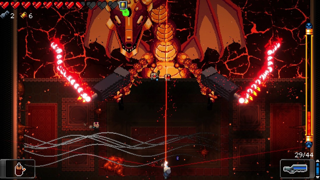 My third and final example comes from Enter the Gungeon, a bullet-hell roguelike published by Dodge Roll in 2016. Being a bullet-hell, a game such as this is typically going to have a very full screen, which the developers accommodated for in their UI design. They did this by pushing all of the essential information against the sides of the screen, which leaves plenty of open space for combat to occur. These essential items are still brightly colored however, in order to leave them readily available for the player. Besides this, all of the essential items remain, from player health, to boss health and active weapons, which can be cycled with a button press. As seen in these various examples, every game has something to gain with UI design, whether it be to improve upon player experience, or to add to the game's overall environment. Using these principles of design can in turn greatly improve a game's overall polish and appeal to the player, and we can easily see how developers have been aware of this for some time. Hence why all designs follow the essential formula, all the while being true to themselves and their creative vision.
0 Comments
Now this project took a good amount of time to make, which is both a positive and negative thing in this scenario. I'll start with the negative: This was an extremely stressful project at parts. That concludes the list of negatives. As for the positives, I'm very glad with the way that this turned out in the end, as it achieved a level of detail that I didn't even know I was capable of creating. The variation in terrain, the spread of structures, and different ways that I made use of other students components, I just feel the effort was worth it in the end. And I'm glad I ended with this rather than a rushed product. 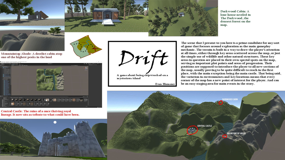 To kick off the design debrief, I'm going to quickly talk about the buildings that I "populated" the island with. Aside from one, I stuck very close to the original design of the buildings themselves, only making slight adjustments here and there whenever there were issues with importing or resizing the pieces. The main difference was in the Mountaintop Abode, which I gave a derelict appearance by placing certain pieces of the house in awkward positions, almost as if they had been ripped off by some kind of storm. These same buildings were placed specifically in areas with different geological characteristics, meaning that the process of traveling to them leads the player through new environments and encounters. That being said, the geography itself does not resemble that of a typical island, which is entirely the point, as the "imaginary lore" behind the island is that it is completely unmapped, and often difficult to reach in the first place. This atmosphere makes it easy to fill the land itself with as many mysterious things as humanly possible. Outside of this general criteria, I stuck to making a generally mountainous terrain, with the only areas actually considered "mountains" being especially tall and rocky. I also made sure to take advantage of the ability to generate forests, with one of the main structures being placed in the densest forest on the map. Overall, I don't think I would have this environment any other way (I bet I'll come to regret saying that). For a first try, this is not bad at all! And I hope to keep this streak up as we move into team activities.
As part of our refresher course in 3D modeling, our class was tasked with constructing our own personal buildings through the use of modular design, which is the process of using various units and pieces to create a completed structure. Not only does this technique help limit memory space, it also allows for far more safety nets when creating a structure, as repeated walls and foundations keeps the building within an easy to understand ratio. 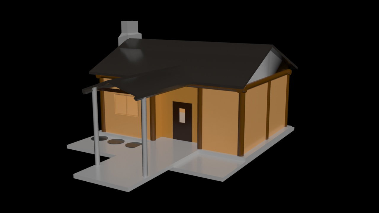 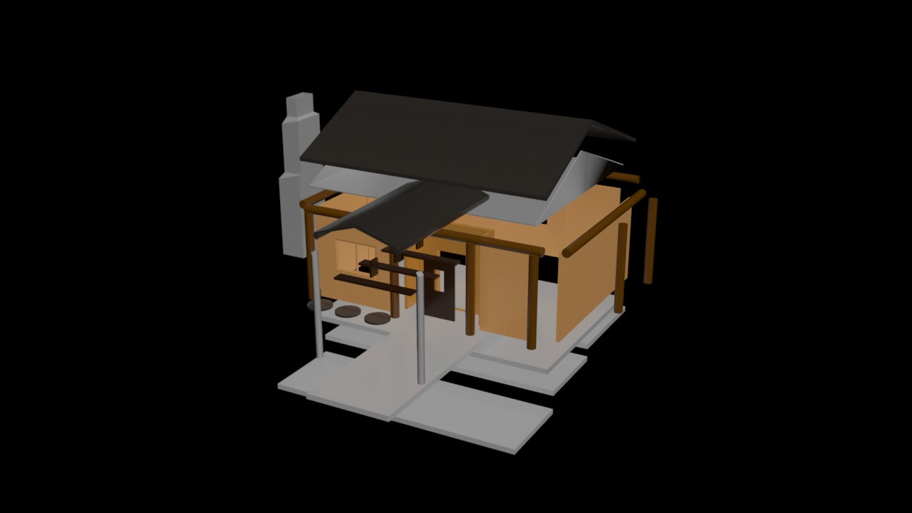 Now I won't say that my particular building was the most interesting of the bunch, because it's absolutely not. Regardless of its simple nature, I put in the effort to maintain some level of complexity, mainly through the addition of log beams and a porch. As is typical for houses modeled like this, I ended up making each wall a separate element, with a few having windows just to open up the exterior. I did also chose to make the stone base out of multiple pieces, this allowed me to connect it to the stone porch and make and add just another 3D layer to the piece. Beyond that, it comes with plenty of standard house features, mainly an extra chimney on the side, so again, not super out of the ordinary. I did attempt to experiment with wall shapes along the way, but was unable to find something that looked even vaguely good in the time I had to finish it. While I think that the house itself is perfectly fine, I do still find myself to be irritated by the idea that I could have done so much better, which I may have to live with until the next assignment rolls around. I guess this can at least serve as an example until then.
Every time we use a new tool in class, we end up talking about it in some way. So this time, I will be talking about compound objects. Compound objects are the combination of two or more objects to create a single shape, wether it be a hole in a square, or letters attached to a box. The addition of this new tool makes everything so much easier, as I can now make certain shapes in 3 steps instead of 10. 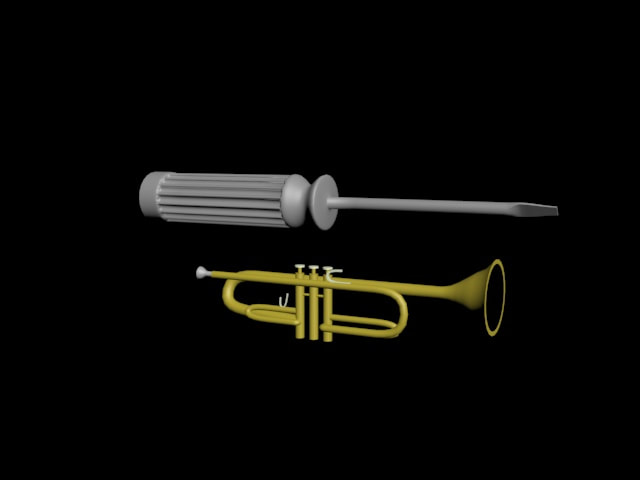 The picture above is an example of my favorite among these new tools, which is the Loft tool. Its job is to create a shape out of the characteristics of two others, such as making a cylinder out of a line and circle. But then there's the option to change the direction of that new shape as well, which can be used for a variety of things, such as the trumpet above. This one is my favorite due to how much time it saves me, as making both of those with older techniques would have taken me a week, but instead this took me under half of that time. 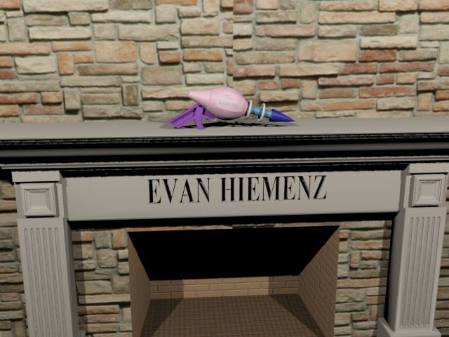 The next topic is the ProBoolean compound tool, taking the title of most helpful tool. It earns this title due to how it works as many different tools in one. Addition, intercept, attach, you name it. This tool is also a huge timesaver, as it allows for the user to use to create multiple compound objects without having to search for five different tools to use. The picture above is a great use of its various features, as every detail on the fireplace was made using ProBoolean. That ends it for my list, with both of these choices making modeling much easier. Which I will certainly need for the future, as this 3D Modeling stuff definitely won't get any easier.
Many kinds of media around the world use some form of design elements or principles, from games, all the way to company logos. And for this post, I'm going to have two screenshots from two well designed games, and analyze their designs.  First up is an image from an upcoming game called Anthem, releasing in February of next year, and one I'm personally looking forward to. There are multiple kinds of design techniques used in this scene, but lets start with the elephant in the room, or more like the monster in the room. Being the largest thing in the image, people will almost immediately look at it, and considering how some of the players standing next to look tiny, there is definitely examples of scale being used here. The second most noticeable piece is the largest player in the frame, they're not the center of the image, and if you use the Rule of Thirds (putting an imaginary 3x3 grid through the image), then that character is right along one of those lines. And one thing that this image doesn't entirely have is the Rule of Odds, the closest they get to that is the three characters around the monster. 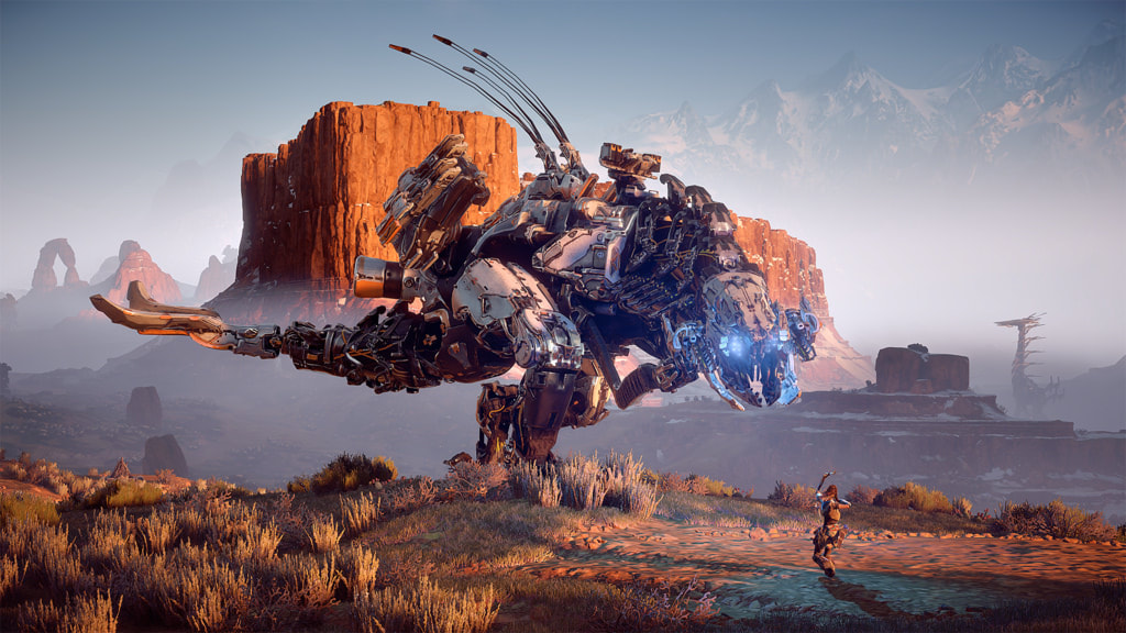 This second image is from Horizon Zero Dawn, which is a game that I have both played and completed. Scale is also once again used, but in two places this time. One being with the player and the monster next to her (Thunderhead), and the large monster in the distance (Tallneck). The Thunderhead in the front towers over the player so a sense of size is very clearly established, and is even further expressed by how the Tallneck in the distance is still quite easily seen despite how far away it is. The Rule of Thirds is seen by how the main character is right along one of the lines, and unlike the first image, the Rule of Odds is more distinctly used, with the three characters in the image. While at the same time, in a way contrast is also used, with the wide rocky landscape and the robotic beasts standing out. Regardless of what kind of form that design is used in, it is essential to good piece of artwork, a well taken photo, or any other kind of media.
Anthem Image:c1.staticflickr.com/2/1866/44687546612_acec1bf7e2_b.jpg Horizon Zero Dawn Image: c1.staticflickr.com/6/5679/30595768840_937acaa124_b.jpg Update: Anthem did not turn out well
Colors are a large and very fundamental way to display an image or express an emotion, whether its in games, web design or other forms of media. Its quite hard not to see a form of color somewhere, and even the absence of color is occasionally used to display a certain message.  The screenshot to the left is from a video game called Legend of Zelda Breath of The Wild, created by Nintendo. And this scene is what is known as the "blood moon", which revives all enemies that you had recently killed. Not only does the appearance of this phenomenon mean that dangers are on the way, but the colors are also used to express that extra display of evil. The color palette used in this occurrence is called Arseny, the combination of black and a variety of reds leads to a feeling of dread or might even make you scared, which is quite common the first time people see this thing. Since this is such a strange and unknown force to new players, the designers wanted to specifically give them a strong sense of fear. And from experience, I can say that they did a good job. But aside from this, most of the time this game is primarily using lush green colors and certain grays for mountain ranges or deep blues for oceans. This is to complement the vast and beautiful landscapes packed into this game. So if you were to look at this same screenshot without the blood moon, it would be a breathtaking sight. So in Summary
Other References: “Color Palettes Color Schemes.” Color Hex, www.color-hex.com/color-palettes/
www.color-hex.com/color-palettes/ |
AuthorI have a passion for creating things, and hopefully one day those things will be video games. You can check over on this blog if you wish to see any updates on my work or other subjects. The views and opinions expressed in this blog are solely those of the author and do not represent those of Durham School of the Arts or Durham Public Schools.
Archives
May 2022
Categories
All
|
 RSS Feed
