|
3D Modeling continues to take up a sizable amount of our assignments, but does seem to become increasingly complicated as well, with the addition of modifiers and material assignments. While my opinion about the topic may not be very different, one thing is, and its that I find it a bit more interesting. The introduction of modifiers makes it so that certain tasks that require a long list of steps, can be preformed by just putting a certain setting in place. Doing this eliminates the need to create multiple shapes in order to make one larger one, which basically sums up the entirety of my first modeling assignment. This is done by adding certain traits to a shape, such as smoothing edges and covering up gaps, which barely sums everything that is available. 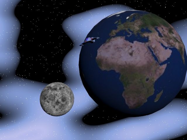 The image above takes use of texture mapping, so that all of the different shapes aren't just a bunch of simple colors. While this feature doesn't just allow you to put pictures on the shapes, but you can also add smaller features on the shapes, such as small bumps and craters, which are actually on the moon, but are a little difficult to see. One strange thing about mapping is that the way you use it needs to be very specific, by having to move output and input points between certain materials. And doing this can be occasionally tedious with the massive amount of options within a single material. Now that we're further in the 3D Modeling unit (and is not ending anytime soon), I still find this to be quite easy to pick up on. While saying something like that might be invoking the wrath of my teacher, (sorry), I really don't hope that this topic becomes any more difficult, for I'm going to be here, forever.
0 Comments
My class has just begun to get into the basics of 3D modeling, which so far, seems interesting. Most of what we have done so far is creating models through simple shapes, like spheres or boxes. The experience seems, (and I might be getting ahead of myself), a little easy. While the software gets a little more difficult with the introduction of subobjects, enhancing the detail of a model. Such as the image below, which is my first time working with the particular subject. Quite simple so far. (Still ahead of myself). 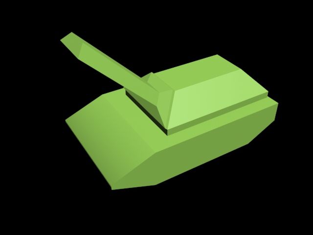 One of my works with subobjects, but not my most detailed. I honestly find the mechanics to also be quite straight-forward, with the tool symbols ACTUALLY looking like what they really do. And working with subobjects is also quite interesting, as well as fun. Going deeper into the certain features for changing a shape is where it gets complicated, because if you have wire-frame mode on while adding sides to a shape, then the screen can get quite cluttered and confusing. The entire setup of the software is familiar to me anyway, since it has many similarities to the setup of some Adobe products. But the variety of tools can make 3DS Max confusing. It covers so many pieces, but can take ages to master all of the tools and techniques. Although, since it has so many tools, it gives you great control over everything, so you could turn a single box into a detailed car. I do genuinely hope this software doesn't drive me crazy, since both Mr.B and students in other classes claims that it gets old quickly, as it will be the main focus for the rest of my school year, as well as the entirety of next year. *sigh*.
Sources: 22Admin22, and About 22Admin22. “3D Max VS Maya - The Pros and Cons of Each Animation Software - The Apple Repair Station- Mac Parts and Apple Repairs Specialist, Business, Education and Home User Support, London.” UK, 3 Feb. 2017, applerepairstation.co.uk/3d-max-vs-maya-the-pros-and-cons-of-each-animation-software/.
iMeshup. “3ds Max: Pros, Cons, Quirks, and Links.” Medium, IMeshup, 13 Sept. 2018, medium.com/imeshup/3ds-max-pros-cons-quirks-and-links-a2a48832dbbe. Over the course of my class learning the basics of animation, we were introduced to Adobe Animate and After Effects, designed for that very purpose. Now that the new unit is moving into audio/video editing, the newest software to us is Adobe Premiere Pro. All of these pieces of software have their pros and cons, with each one designed for a certain purpose. But I found some of them to be easier than others. The first two to compare are Animate and After Effects, with these two being the most similar of the three. I personally found After Effects to be easier to use and catch up on, even though I've only used it for one assignment so far. The process of creating movement in this software is simple, just set a keyframe somewhere on the timeline to signal where the movement starts, then move forward on the timeline, use the options on the side to change the certain objects position, and set another keyframe at that point. The system will automatically create how the object will move between those two points, which is much faster than doing everything manually.  This simple process of movement doesn't mean that After Effects is perfect, since there is only the ability to move objects from point to point, it makes the options for certain kinds of movements a little limiting. That's where Animate comes in, with the options for movement being wider, but more difficult to put in place. Using Animate allows for cleaner movement, but can be a slight pain at times, but it proved to be relatively painless for me, most of the time. If I were to choose between the two, I would choose Animate, simply due it's extensive array of options, colors and tools to help with the animation, even if it can be frustrating at times. Now, on to Premiere Pro, which is meant for a different use than Animate and After Effects. Now, I've used it pretty little so far, but it seems easy enough to pick up on, with the use of putting items at certain points on a timeline, similar to After Affects. Although Premiere, has slightly more advanced options for the creation of videos, but I still see it to be simple, (that opinion will probably change later). The new kinds of software are being introduced more quickly than earlier in the year, where Photoshop took over a month to get past. For this reason, it's harder to look deeper into these new pieces of technology. Regardless, I seem to be using them without TOO much trouble.
After a good amount of work in Illustrator, it's time for my class to begin some work with animation. With film studios such as Disney and Pixar producing classic animated films, the entire industry is rapidly increasing with massive profit. But there's a downside, 3D animated films aren't created as quickly as other types of movies, for good reason. Animation developers create entire worlds from scratch, so there is an insane amount of steps to the process.  The beginning of this process almost always storyboarding and sketching. Allowing for a rough image of what the film or game is supposed to be, this step in essential to the pre-production of a product. The next major stage is the actual creation of 3D models, which is done by overlaying 3D meshes and lines to create shapes. Kinds of software more known for this step are Maya and Adobe Animate. The remaining steps of the production involve giving the shape movement and adding details such as texture, lighting, e.t.c. The creation of the product is eventually finished in post-production with the addition of audio and adjusting the work to appear on a screen correctly. I decided to discuss this kind of animation for the reason that it allows for more detail and expression than other types of animation available. So larger, more complex creations are possible. Knowing how the steps of animation work is an incredibly helpful source for the works ahead of me. So it should help prevent me from creating too many monstrosities.
Sources: Chang, Aldric. “The Process of 3D Animation.” MediaFreaks, 5 Oct. 2018, www.media-freaks.com/the-process-of-3d-animation/. My class is continuing the use of Illustrator, slowly getting into more complex assignments and creations. And if I'm being honest, it has many pros and cons compared to Photoshop. One being that it is much easier to create more complex shapes, with multiple tools centering around that exact function.  The picture above is from my most recent assignment using Illustrator. This assignment in specific uses multiple tools for even the smallest parts. One of them being the notorious pen tool, the tool that requires plenty of practice and has caused so much frustration in this piece of software. Once you know how to use it though, it's a very useful tool for creating more unique shapes, which is how I created the toppings to the burger. Another one of the most frequent tools in this assignment is the mesh tool, allowing the user to incorporate a certain color into a part of the image, giving it a 3D appearance. I especially enjoy using the mesh tool, even though it may take some time to get the coloring right, it creates a very breathtaking image once you've done it correctly. The entire software of Illustrator is extremely useful for creating logos or simple artwork while you're the pre-production stage of a project. But to create more elaborate or thought out images in this format, you have to know what tools to use and how to use them.
I've been working with Photoshop for a few months now, and I've discovered that not only is it quite fun, but your choice in tools can make a big difference, especially with holidays like Thanksgiving and Christmas rapidly approaching, I'm already brainstorming some tools I can use to make some festive pieces. There are many different tools that are special for certain projects, but of all the options, one I've been using quite often is the Quick Selection Tool. If you may not understand what that is, it's used to select a certain section of a layer in an image, which can make editing that section much easier. It's a very basic tool, but its accuracy is what proves to be helpful with editing images.  The image above is from one of my assignments in class, an image of a dock that was originally grayscale (black and white). Creating something like this requires a number of tools, but as you could have guessed, I primarily used quick select. Since you have to mess with many individual pieces of the image, you need specific tools to select each piece. I found quick select to be the easiest to use due to how it's more accurate than the magic wand, and how you can easily deselect parts of the layer, there is also the option to mess with the size, edges, e.t.c of the selection brush. Not that the magic wand isn't helpful, it just selects everything of similar color (which in a grayscale image, is everything), so its not too effective in more complicated images. Although, Photoshop is massive, so there are many kinds of selection tools to use. Though Quick selection is used so often that its also used by professionals, mostly because of its overall simplicity and usefulness. In the case of Photoshop, sometimes it's better to be simple.
Sources: Annie. “Photoshop Selection Tools Explained.” Annenbergdl.org, 26 Mar. 2018, www.annenbergdl.org/tutorials/photoshop-selection-tools-explained/.
Many kinds of media around the world use some form of design elements or principles, from games, all the way to company logos. And for this post, I'm going to have two screenshots from two well designed games, and analyze their designs.  First up is an image from an upcoming game called Anthem, releasing in February of next year, and one I'm personally looking forward to. There are multiple kinds of design techniques used in this scene, but lets start with the elephant in the room, or more like the monster in the room. Being the largest thing in the image, people will almost immediately look at it, and considering how some of the players standing next to look tiny, there is definitely examples of scale being used here. The second most noticeable piece is the largest player in the frame, they're not the center of the image, and if you use the Rule of Thirds (putting an imaginary 3x3 grid through the image), then that character is right along one of those lines. And one thing that this image doesn't entirely have is the Rule of Odds, the closest they get to that is the three characters around the monster. 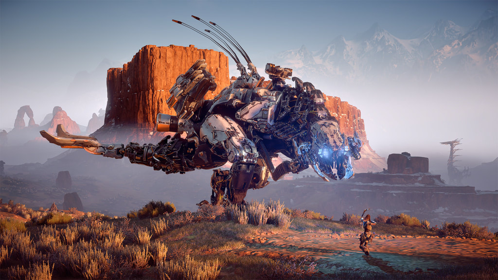 This second image is from Horizon Zero Dawn, which is a game that I have both played and completed. Scale is also once again used, but in two places this time. One being with the player and the monster next to her (Thunderhead), and the large monster in the distance (Tallneck). The Thunderhead in the front towers over the player so a sense of size is very clearly established, and is even further expressed by how the Tallneck in the distance is still quite easily seen despite how far away it is. The Rule of Thirds is seen by how the main character is right along one of the lines, and unlike the first image, the Rule of Odds is more distinctly used, with the three characters in the image. While at the same time, in a way contrast is also used, with the wide rocky landscape and the robotic beasts standing out. Regardless of what kind of form that design is used in, it is essential to good piece of artwork, a well taken photo, or any other kind of media.
Anthem Image:c1.staticflickr.com/2/1866/44687546612_acec1bf7e2_b.jpg Horizon Zero Dawn Image: c1.staticflickr.com/6/5679/30595768840_937acaa124_b.jpg Update: Anthem did not turn out well
Colors are a large and very fundamental way to display an image or express an emotion, whether its in games, web design or other forms of media. Its quite hard not to see a form of color somewhere, and even the absence of color is occasionally used to display a certain message.  The screenshot to the left is from a video game called Legend of Zelda Breath of The Wild, created by Nintendo. And this scene is what is known as the "blood moon", which revives all enemies that you had recently killed. Not only does the appearance of this phenomenon mean that dangers are on the way, but the colors are also used to express that extra display of evil. The color palette used in this occurrence is called Arseny, the combination of black and a variety of reds leads to a feeling of dread or might even make you scared, which is quite common the first time people see this thing. Since this is such a strange and unknown force to new players, the designers wanted to specifically give them a strong sense of fear. And from experience, I can say that they did a good job. But aside from this, most of the time this game is primarily using lush green colors and certain grays for mountain ranges or deep blues for oceans. This is to complement the vast and beautiful landscapes packed into this game. So if you were to look at this same screenshot without the blood moon, it would be a breathtaking sight. So in Summary
Other References: “Color Palettes Color Schemes.” Color Hex, www.color-hex.com/color-palettes/
www.color-hex.com/color-palettes/ Last week, my class finally started with the basics of Photoshop; a system that I had been anticipating ever since the beginning of the school year. I'm very excited about using it and the works that I could create. Photoshop is used so often these days that now it's practically an essential to digital editing. Due to this popularity, it has a large list of pros and cons. As is already known, Photoshop is incredibly useful for many industries, photography, graphic design, web design, the list goes on. This is due to it's wide variety of tools and features that are perfect for the duties of those careers. On the con side, because it has so many helpful features, it can lead to an overwhelming experience for beginners. At the same time, the very fact that it's used so much leads to misleading images of many things. Whether it's misleading body images from the fashion industry, or it's images that are overall completely fake and used for other reasons. In Summary Photoshop is...
But also
|
AuthorI have a passion for creating things, and hopefully one day those things will be video games. You can check over on this blog if you wish to see any updates on my work or other subjects. The views and opinions expressed in this blog are solely those of the author and do not represent those of Durham School of the Arts or Durham Public Schools.
Archives
May 2022
Categories
All
|
 RSS Feed
